A wipe is a type of transition on screen, it moves through shots by pushing one shot out by another. This creates a smooth flow of shots that can be used as establishing shots for the opening of a film.
The example that I would draw inspiration from is in Shaun of the dead
...
...
After the conversation with the main protagonist, the film continues to give more detail as to the location and social standard of the film using a series of shots that wipe from one to the next.
Monday, 2 December 2019

Pre-production points
Characters:
Extraneous points:
- Main protagonist - Danny Romero - Intertextualising genre directors (Danny Boyle, George A Romero)
- Love interest - Mia Jones
- Best friend - Fred East - intertextualises Fred West, a serial killer
- 3 to 4 zombies
Extraneous points:
- Cornetto trilogy + Shaun of the dead - Cornetto ice cream, like in Shaun of the dead
- Shallow focus (zombie eating body from far away)
- decaying title
- slow zombie movement type, unlike 28 days later
Saturday, 23 November 2019
DDC: Digitisation, Disruption and Convergence
Digitisation
The ongoing but advanced process of moving from analogue (eg VHS) to digital production, distribution and exchange, which has reduced costs and time, which led to convergence and disruption
Disruption
Radical changes to the established methods of distribution, often leading to new competitors arising
Convergence
The reducing gap between professional and amateur/consumer/prosumer level equipment; the shrinking distinction between audience and producers as old top-down approaches and passive audiences are replaced by active audiences (web 2.0) and a dynamic two-way flow (UGC); the blurring of once clear divides between media industries - film and TV are notable, and think about how both now extend across web and smart devices too, plus VR
E.G
Film4 and the BBC are UK TV channels/producers with limited funds for film production. Where Amazon and Netflix spend billions worldwide, and over $100m just in the UK, the combined TV/film budget of all traditional UK TV channels (and their film wings) is far less than Netflix's UK spend alone. They pay upfront for rights to low budget films like Warp's output. This, combined with non-repayable grants from the likes of the UK Film Council(today that is the BFI) and its regional wings like EM Media and Screen Yorkshire(using government and National Lottery funding), or EU funds. These grants ensure cultural diversity in film production, which would be impossible on raw commercial terms.
Thursday, 21 November 2019
Film opening analysis of About a Boy
- Fade up
- Audio bridge to first scene
- Diegetic sound from TV
- Bird's eye view
- Tracking shot
- Protagonist - proppian archetypes
- Rule of thirds
- Narrative enigma - not showing protagonist's face
- Intertextual reference to 'Who wants to be a millionaire'
- Camera movement and zooming, connotes tension
- Anchored tension with tense music from tv show
- His answer to the show foreshadows events - In addition he is most likely to relate to Jon Bon Jovi character, connoting comedic genre
- Voice over - inner monologue
- Non-diegetic sound - guitar strings
- Red Bull signifies youth, not very smart
- Tea cup with saucer juxtaposes with the Red Bull because it signifies older age and sophistication
- Cigarettes - negative connotations - complex preferred reading
- Campbell's hero's journey/monomyth - all narratives center on journey and progression of protagonist
- Big book - intelligence, sophistication
- Lower case bubble font block white - connoting comedic genre
- Navy blue slacks, gry blue crew neck jumper, blue shirt, grey blue monochromatic mise-en-scene - conservative guy
- Large collection of books and LPs, electric guitar, speakers - rebellious, again connotes complex preferred reading
Wednesday, 20 November 2019
Theme 2: Titles
THE RAW NUMBER
- Around 4 titles appear at the beginning of the film
- The time titles last can be often as long as 4 minutes or as short as 20 seconds
THE SPECIFIC WORDING + ORDER
- When a title refers to a company, it will present that company with 'In association with Company X' or 'Company X presents'
- When presenting the director, the wording is usually 'A film directed by Director X', however if the director is an auteur the wording is 'A Director X film'
- Actors are often listed using ' Introducing' however if the film is a star waggon 'starring' or 'featuring' is more common
- Films often go company, director, then actors however this changes depending on several factors. An example is if the director is an auteur, their title is more often first. This is a similar circumstance to films that are star waggons.
DESIGN
- The style of the titles usually is based around the genre, similar to points like the title colour and font.
- Serif fonts are often used in genres such as romance, drama, social realist, horror, slasher and thriller. Serif fonts tend to signify a more serious film. Where as fonts that are Sans serif are used for genres like action and comedy, as they can be impactful or simple
- Depending on the importance of the title, such as a 'starring' title, or an auteur title, the font size will be bigger and tend to stand out more.
- Whether the title is uppercase or not depends, as it can be used to bring focus to the title, however it doesn't fit with some genres such as Romance
- The colour of the title is most commonly white, as it can be used with most genres if not all, in combination with the font. It also allows important titles like star or auteur to be further highlighted by having them on a black background ( a common background )
FX, ANIMATION
- Non-diegetic titles are titles that are added post production and often move through the scene all though don't effect, just look cool. An example of this is in Zombieland
- Equally there are also diegetic titles that are in the scene that actors could touch or see in real time.
- Often titles just fade out, however different title transitions are also based around genre, so that they fit better with the film.
Sunday, 17 November 2019
THEORY Postmodernism, Deconstructionism, Intertextuality, and Simulacra
...
...
Postmodernism.
Postmodernism argues that all 'isms' (E.G capitalism, communism) are meaningless because these meta-narratives can no longer explain how the world run. However it is extremely self contradicting because Postmodernism is an ism!
The concept of postmodernism refuses definition to some extent, but Dominic Strinati outlined 5 key characteristics that help break it down:
- Breakdown of the distinction between culture and society
- An emphasis on style over substance
- Breakdown of the distinction between high art and popular culture
- Confusions over time and space
- Decline of metanarratives ['grand theories such as Marxism, Christianity and ... modernism have lost their use for current societies']
Deconstructionism.
This refers to the use of existing convention for ironic purpose, in a knowing way, and the audience is assumed to be in on irony.
A perfect example of this is in the movie Scream, the Matthew Lillard character decides to get more drinks and as he is leaving he dramatically calls out "I'll be right back", a reference to the classic horror convention that denotes a character will be killed. The other teens at the party respond with the knowledge of this old trope, all of this happens whilst in a scene where they're watching Halloween. Craven is deliberately making fun, or attacking the genre he played a role in creating 1972's The Last House on the Left.
This occurs in all media, the Depeche Mode video is a classic example, breaking down the band's poor tawdry image and the male gaze.
This occurs in all media, the Depeche Mode video is a classic example, breaking down the band's poor tawdry image and the male gaze.
...
...
Intertextuality
A simple but important concept that originated from Kristeva. It refers to the idea that, for an audience to access the preferred reading (Stuart Hall) they must have knowledge of a secondary text, which is usually a older text that is referenced in a newer text. This is most easily seen through TV shows such as the Simpsons as they are built around the very concept, but there is a very strong presence of this idea in the slasher genre. This is why John Carpenter cast the daughter of the 1960 scream queen, as his final girl. It helps gain publicity.
Simulacra
Scary movie best represents the ideas above. It takes intertextuality to a new level with little details like how Screams working title was scary movie, and the film is a comedic remake. It very clearly, and quite literally, shows the conventions (eg the Carmen Electra scream queen sees a sign giving the options for either death or safety... and runs up the stairs where the death sign points to, as the dumb scream queens tend to).
These movies have been analysed in detail, especially as far as gender representations. Baudrillard might argue that this leads nowhere as there is no ultimate meaning behind an endless limits of signifiers; Scary Movie is an expression of many existing ideas or signifiers, which cannot be tracked back to any concrete 'true reality' or meaning.
...
References
DB (2011) Theoretical evaluation of production post on blogger [online] Available from http://prodeval.blogspot.com/2011/04/postmodernism.html [17/11/19]
...
TITLES scream main title
Sounds
- High pitched female scream
Very stereotypical in slashers, helping create suspense but also helping to anchor a preferred reading
- Heart rate speeding up
Helps create suspension and build up fear throughout the trailer
- Phone ringing
Again helps to create suspension, and the ring sound the phone makes is very average which helps anchor the slasher genre
- Crash sound effect
Not only helps build tension to the literal breaking point but also serves as an audio distraction so that the viewers are distracted by the sound so its harder to focus on what just showed creating sense of mystery
-Wolf howl
A stereotype to the slasher and horror genre, again anchoring the preferred reading
- Knife slashing sounds
Another stereotype to the slasher and horror genre. Could be an intertextual reference to past slasher classics
- Gunshot
Again not only helps build tension to the literal breaking point but also serves as an audio distraction
- Violin
Massive effect on the tension, and an intertextual reference to Psycho
- Audio Bridge
Helps keep the audience engaged
Ident
- Blue tint
Intertextual reference to Halloween opening
- Sans serif font
Commonly used in slashers as its very bold matching music
-Black background
Use of dark colours with a black background helps anchor preferred reading
...
(Scream trailer)
...
Updated Film Opening Pitch
...
Changes looking to be made:
- Addition of a postmodernism element
- Changing newspaper to new broadcast
Credits to: Spikey Films
...THEME 1: Idents, Companies, Production Context
WHAT ARE IDENTS?
-Idents show the main companies involved with a movie's creation and production, This could include any of the big 5 (Sony, Universal, Paramount, Warner Bros etc) or another well known example of Disney's castle
-idents are at the beginning of a film, for both publicity and to help show the genre of the film
-Each ident usually has an average time of 6-7 seconds, adding a total of around 20-30 seconds at the beginning of the film
-Often an ident has a simple style for easy viewing and can help easily anchor a preferred reading
-It is common to see 2-4 idents at the beginning of a film
-An outlier is often seen in indie movies as the commonly have no idents at all
-When the conglomerate is larger, they will have more screen time for their idents (Big 5). A larger conglomerate also rarely uses audio bridges, as they are not trying to produce art, but instead money, making it cheaper.
...
(Warner Brothers Ident)
...
...
(Paramount pictures Ident)
...
(Summit entertainment Ident)
...
(Disney Ident)
...
-Idents show the main companies involved with a movie's creation and production, This could include any of the big 5 (Sony, Universal, Paramount, Warner Bros etc) or another well known example of Disney's castle
-idents are at the beginning of a film, for both publicity and to help show the genre of the film
-Each ident usually has an average time of 6-7 seconds, adding a total of around 20-30 seconds at the beginning of the film
-Often an ident has a simple style for easy viewing and can help easily anchor a preferred reading
-It is common to see 2-4 idents at the beginning of a film
-An outlier is often seen in indie movies as the commonly have no idents at all
-When the conglomerate is larger, they will have more screen time for their idents (Big 5). A larger conglomerate also rarely uses audio bridges, as they are not trying to produce art, but instead money, making it cheaper.
Examples of Idents
...
(Warner Brothers Ident)
...
...
(Paramount pictures Ident)
...
(Summit entertainment Ident)
...
(Disney Ident)
...
Thursday, 24 October 2019
Film Opening Pitch 1
Genre
- psychological thriller
I picked psychological thriller to allow for more experiments trying to build up tension and how to get the audience on the edge of theirs seats
Characters
- Josh a 40 year old male with black hair and a masculine face with no facial hair, average high and in good shape
- Jaziah a 20 year old male with blond hair with a young face no facial hair, slightly under average and in good shape
Base idea
- Working Title 'Two bullets in the chamber'
Main character 'josh' ex marine commander dealing with form of PTSD, Josh's job revolved around keeping everyone in sync but then also having to deal with the dark sides of the military E.G( wife beating, suicide, homicide, other traumatising experiences and ect..) but he blames himself for some of the examples above as he sees his troops as family and to him these acts are his fault.
Conventions
- POV shots
- Flashbacks
- set/costume design
- mis en scene
- screen colouring
Pitch
The synopsis is that we see Josh in a plain room, and we immediately see him having a nightmare and then it cuts to a flash back of him in the military. Soon after that we see that he is struggling mentally because we see conflict in his mind of wether his friend shot himself or he shot his friend, now the means that there is a question to be asked 'did he actually or is it him blaming himself'. finally after the gunshot Josh shoots up and moves around his room, until he takes a gun from his desk and leaves the room
MORE DETAIL
- Opens to a grey apartment room ( similar to the newest version of Sherlock Holmes ) and josh is in bed, visibly having a nightmare, the camera will slowly pan onto his face. Once Josh's face is centre screen a flash back to him and one of his marine friends talking on training grounds and then another quick cut to his face and then into Josh's friend in a black room in a chair with a gun to his head, another quick cut and then cut back and in a flash josh now holds the gun against his friends head. This scene builds up until a gun shot is heard with a pitch black screen, until finally it cuts back to josh shooting up on his bed at the middle of the night, then the scene continues with Josh going to his desk picking up his belongings until he picks up a gun and leaves, the door shut is where the opening should finish.
Signifiers
- plain apartment room ( working class)
- military costume + background training ground (ex marine)
- gun in desk ( ex marine )
- crushed beer can on the floor ( problems / alcoholic )
- masculine strong male shows protagonist
Challenges and Opportunities
- Creating the tension of the gunshot will be hard to build up
- trying to get access to a military training ground could be hard
- getting the timing right with each shot
- making the signifiers key to understand so that the preferred reading is anchored
- Lots of potential for shot types
- lots of media language potential for use when having to use it in exam.
- very easy to anchor the preferred reading
- Good practice for improving cinematography skills
Inspirations
- Sherlock Holmes
-Alien
-Dead man waling
-Dead man's shoes
-This is England
Thursday, 17 October 2019
Semiotics rap
Semiotics rap
Connotations and connote
Like a sailing boat
Now your thinking of a captain
With a big hat that’s 10/10
That’s symbolic like a three shot
It connotes scenarios, like a lot
An example is a love triangle
Or if it was horror there’d be a Dutch angle
The next word is denote
That’s the textual detail in a goat
Well that’s an example but what you should project
Is To describe the detail of an object
It’s not about symbolism, unlike a baptism
It’s about what happens not what you think about them
It’s a bit like this rap
You shouldn’t think about it you should just clap
Now we come to narrative enigma
Could show the presence of ligma
Okay now all jokes aside
It’s how the director makes a hidden side
This could be like a high angle
To show a character is week and might get strangled
It’s all about the suggested info
How a character might feel low
Up next is detail that is intertextual
Like Rick and Morty being intellectual
It’s about understanding references
It helps appeal to target audiences
An example would be the simpsons
The amount of references, theres tons
Without the intertextual knowledge
The show would be as funny as a dying hedge.
That’s the end of my rap of semiotics
Before someone needs antibiotics
I hope I got all of this right
Otherwise my media grades arnt in sight.
Friday, 11 October 2019
SEMIOTICS applied to Warp film posters
THIS IS ENGLAND

This is England immediately signifies that its is a social realist production based in England. This is anchored by the title being the colour of the union jack.
Either side of the poster, two buildings are framed either side signifying working class characters. This is further anchored by the urban decay on the fence/ font. All males in the poster are skinheads which anchors working class
'A film by Shane Meadows' denotes the auteur film theory.
Wide long shot denotes ensemble cast, Not a star vehicle. It also signifies a community relationship
The film is based in the 1980's, however nothing signifies that so it is polysemic .
DEAD MAN'S SHOES
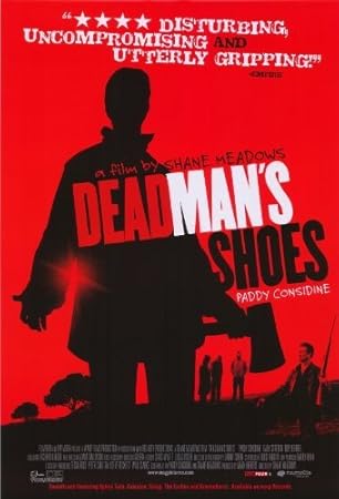
The use of bubble font usually signifies comedy however in Dead Man's Shoes the polysemic is immediately anchored by the reviews.
This is also anchored by the axe as it signifies violence.
The framing of the main character on screen, being a dutch angle and low angle suggest that there is something very wrong about the character.
The red background and font signifies blood and also anchors the idea of this movie being a horror
TYRANNOSAUR
 Rule of thirds, centrally framed connoting this man as the protagonist
This is England immediately signifies that its is a social realist production based in England. This is anchored by the title being the colour of the union jack.
Either side of the poster, two buildings are framed either side signifying working class characters. This is further anchored by the urban decay on the fence/ font. All males in the poster are skinheads which anchors working class
'A film by Shane Meadows' denotes the auteur film theory.
Wide long shot denotes ensemble cast, Not a star vehicle. It also signifies a community relationship
The film is based in the 1980's, however nothing signifies that so it is polysemic .
DEAD MAN'S SHOES
The use of bubble font usually signifies comedy however in Dead Man's Shoes the polysemic is immediately anchored by the reviews.
This is also anchored by the axe as it signifies violence.
The framing of the main character on screen, being a dutch angle and low angle suggest that there is something very wrong about the character.
The red background and font signifies blood and also anchors the idea of this movie being a horror
TYRANNOSAUR

However, prop, lighting, mise-en-scene etc connote he could be the antagonist
Own binary opposition - creating narrative enigma
Serif font signifying a drama genre Wrinkles - older man - older audience
Skin head, vest top - working class
High key lighting on only one side - reflects his two different personalities - drama
Own binary opposition - creating narrative enigma
Serif font signifying a drama genre Wrinkles - older man - older audience
Skin head, vest top - working class
Terraced houses on edge of poster - working class
High key lighting on only one side - reflects his two different personalities - drama
Subscribe to:
Posts (Atom)