Saturday 29 February 2020

General Conventions: General Media Language

Sound and Genre signification 

Like mentioned in previous posts the most common sound in a 1st shot is an audio bridge from the titles/idents into the actual film. This being said different audio carries different connotations towards film genres.
This most obvious example is in the horror genre where rock music is often used. An example is in the beginning of the bride of Chucky. 
However this applies to every genre of both music and film. Such as more classical music connotes a more serious piece such as a drama or romance. Where as pop music or just generally more up beat songs would connote a comedy. 

This isn't the only genre signification though, as both titles and just general exposition, through use of mis en scene, provide signification of different genre's. 
A good example of film opening exposition is in working title's About a Boy 
...
...
The coffee cup connotes to a more mature and intellectual person, however the red bull can juxtaposes this.
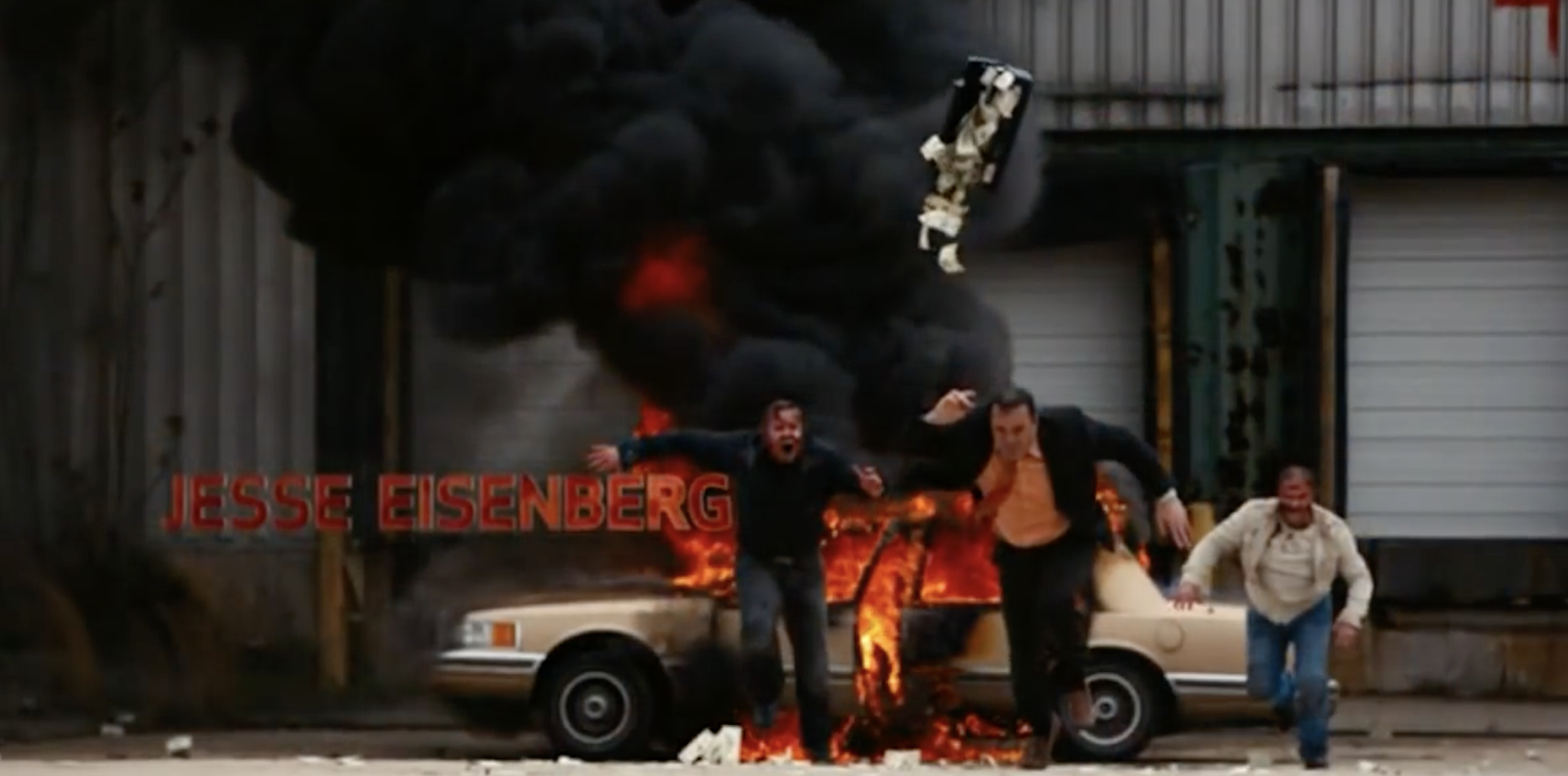


1st Shot

Looked at about 30 seconds for the start

Often -
- an extreme long shot
- establishing shot
- Uses audio from this shot to make an audio bridge from idents
- less significant titles will be on screen
- rule of thirds to show main protagonist
- audio builds up to build narrative enigma (either through volume or through genre of music)
- lots of mis en scene for narrative enigma

EXAMPLES

hot fuzz


-extreme long shot
-yes and no to typical establishing shot, as it isnt outside but it is first shot and its an els and gives us idea of area
- sirens cut sharp when the doors open ( signifies comedy )
diegetic sound of doors open, but its exaggerated diegetic sound.
- Character is rushing which connotesseriousness, takes his job serious and is a serious character.
Rule of thirds, shows hes central protagonist
 (side note 'in association with studio canal' shows junior company)
disguised cut after first shot ( but has an elipses )
- long open take ( 31 sec open take )
- close up of his serious expression, and his badge has same exaggerated impression ( comical )
- A lot of exaggerated points, such as how long his walk is,
- synth note builds up tension
  

Bridget jones's diary


- london/ england taxis
- snow, signifies christmas
medium long shot, rule of thirds, central protagonist
- No hat or umbrella, + blonde female ( male gaze )
- reverse tracking shot, tracking her, voice over = central protagonist
- side note - rural village appears cute, nice little village ( what WT does, normative representation of England )


Narrative enigma + Main protagonist

Like mentioned above this occurs to all the examples already stated and a good point is in working titles About a Boy 
...
...
Well we never actually see the main protagonists face the camera follows the individual, therefor using rule of thirds we can assume that the individual is the main protagonist, yet instead of seeing the individuals face, we see more items and key aspects of his apartment.
This helps build the narrative enigma as all the items play a key role in the exposition of the scene and film, however it stills builds suspense because the man isn't scene till the very end 

Rule of thirds is best shown in movie posters
...
...

In this film poster for BJD, you can Cleary see the female is between two other males, therefor connoting that she is Bridget Jone's 

Mise En Scene 

( Everything already talked about )


Transitioning to the main film

applying this to The bride of Chucky 
...
...
It is clear when the main film begins because the title helps cover the scene transition, but the camera also pans up into the sky and this is a common technique (also visible in Jaun of the Dead) 

However in About a boy the camera doesn't pan into the air and the title doesn't appear, but instead it is that the character leaves the starting point. This is a common point in a film to break the opening from the rest of the film. As it is quite simple denotation of the character leaving their starting point ( Like a board game)

This can be accompanied with a change of music to really highlight the change, and in some scenarios (especially in the zombie genre) when the problem is revealed. 
This is Clear in both Jaun of the Dead and Shaun of the dead 
...
...
...
...

Audience representation and Intertextuality 

It is key to appeal to your primary and secondary audience when making a film, and the opening is to get there interest so a common aim is to have audience representations so that your audience can relate to the film. 
This is clearly distinct between Warp and Working title films 


Thursday 27 February 2020

General Conventions: Titles, Idents, Production Context

Idents 

You often see 3-4 Company Idents at the beginning of a film, however this may change surrounding several different factors
E.G ( The production company of the film )

Different companies have different idents and therefor the length of the ident's time on screen changes, along with the complexity of the ident. A more complex ident may include a lot of CGI and special effects, where as the idents on the simpler side of the spectrum may only have the companies name in a camera shot. This is often based around the companies budget (The higher the budget the better the ident)
This is a great signifier as to the type of production company ( Whether a subsidiary of the big 5 e.g(Working title) or an Indie company e.g(Warp))

A lot of Idents will have their own sound however depending on the film the sound may be cut out in order to build narrative enigma. This being said, its unlikely that a high budget production company, like one of the big 5, will have their ident edited in order to add an effect to the film.
On the topic of audio in the idents of a film, an audio bridge could and often is used ( An audio bridge is when the audio in the film is added before the 1st shot is shown as to allow for a smoother transition from titles and idents into the film. The audio bridge won't cover anymore than 1 ident if it covers any)
Audio Bridges will most likely be added over the last ident, and that will almost never be a large production companies ident and it's much more likely to be a Indie company's ident or a subsidiary of the larger company.

The size of a production company has a large impact on the ident sequence in a film. In addition to all the points already discussed, the larger company will be the first ident shown followed by the smaller companies in order. The amount of time a big 5 ident is on screen is much longer then an Indie's ident length E.G( The big 5 ident could last around 20seconds whereas a Indie may only be 6-7 seconds)


  • audio bridge between titles (eg Bride of Chucky, Baby Driver)
  • Foley sound for verisimilitude (Baby Driver, Chucky)
  • music can be diegetic or non-diegetic
  • Can be used to build tension/narrative enigma

Examples of Idents:


...


(Warner Brothers Ident)
...
 ...
(Paramount pictures Ident)
...

(Summit entertainment Ident)
...

(Disney Ident)
...

One point to note is the fact that three idents for an Indie film combined are still less than the total time the Disney ident is on screen Disney being one of the Big 5 


Titles 

- About 20-30 titles, but sometimes only the companies and the director
- The duration of a title sequence
 is usually about 5 minutes long
- 5 company names are usually mentioned
  • Total time that titles are on screen varies in different scenarios (from 5 mins to minimum of 20 seconds) 
  • When referring to a company, the text will usually say 'In association with' or 'presents'
  • When the director is mentioned, it might say 'a film directed by'
  • Actors will be referred to as 'introducing', 'starring' or 'featuring'
  • If the director is an auteur, their name is likely to be either first for emphasis, or last
  • The fonts change based on the genre 
  • Usually serif fonts would be associated with horror/slasher/thriller style of genre
  • When there is a bigger star, they will earn a bigger title as the aim of the production is to bring more people in with the star power
  • if it is an auteur director, their name is likely to be larger and have a greater focus on it
  • Upper case fonts usually bring a larger focus to them, so the important parts might have a large upper case font
  • The upper case font also depends on the genre as it doesn't fit with genres like romance
  • Colour also depends on the genre
  • horror might have a red or blue tint (intertextualising Halloween if blue)
  • Zombieland is an example of a movie including interactive titles


THE SPECIFIC WORDING + ORDER
- When a title refers to a company, it will present that company with 'In association with Company X' or 'Company X presents'

- When presenting the director, the wording is usually 'A film directed by Director X', however if the director is an auteur the wording is 'A Director X film'

- Actors are often listed using ' Introducing' however if the film is a star waggon 'starring' or 'featuring' is more common

- Films often go company, director, then actors however this changes depending on several factors. An example is if the director is an auteur, their title is more often first. This is a similar circumstance to films that are star waggons.


Starring, With, Introducing, Co-starring (Actors)
Technical Roles (about 10):
          - Casting by x
          - Costume designed by x
          - Music composed by x
          - Editor x
          - Director of photography x
          - Lightning by x
          - Production designer x
         - Screenplay by x
          - Executive Producer, Produced by x
          - Directed by x
Directed by X
(Director is the only one who always gets credited twice)

DESIGN
- The style of the titles usually is based around the genre, similar to points like the title colour and font.

Serif fonts are often used in genres such as romance, drama, social realist, horror, slasher and thriller. Serif fonts tend to signify a more serious film. Where as fonts that are Sans serif are used for genres like action and comedy, as they can be impactful or simple

- Depending on the importance of the title, such as a 'starring' title, or an auteur title, the font size will be bigger and tend to stand out more.

- Whether the title is uppercase or not depends, as it can be used to bring focus to the title, however it doesn't fit with some genres such as Romance

- The colour of the title is most commonly white, as it can be used with most genres if not all, in combination with the font. It also allows important titles like star or auteur to be further highlighted by having them on a black background ( a common background )
FX, ANIMATION
Non-diegetic titles are titles that are added post production and often move through the scene all though don't effect, just look cool. An example of this is in Zombieland

- Equally there are also diegetic titles that are in the scene that actors could touch or see in real time.

- Often titles just fade out, however different title transitions are also based around genre, so that they fit better with the film.


Production context

Indie v Conglomerate


'71 box office (Warp Indie film)
Green Zone box office (Big 5 conglomerate)


There are several points that separate a Indie film from a Big 5 conglomerate film, such as distribution, cast, target audience, budget and overall box office (etc.) Most of these points are intertwined with one another

To start the budget of a big 5 film will always be larger then an Indie companies budget ( E.G - Le Donk and Scor-zay-zee had a budget of 48k compared to Green zone, with a budget of 100million)

With the budget then you can get A-list celerity actors, that help market your film and then you are more likely to get distribution and then finally get high box office figures 

- and clearly Indie companies can't truly do that.


HOWEVER
there are outliers for both sides, such as films like avatar and Star Wars with no A list celebrity actors
and Green zone didn't make profit with the HUGE budget it used


Thursday 6 February 2020

Theme 4: 1st shot

Looked at about 30 seconds for the start

hot fuzz


-extreme long shot
-yes and no to typical establishing shot, as it isnt outside but it is first shot and its an els and gives us idea of area
- sirens cut sharp when the doors open ( signifies comedy )
- diegetic sound of doors open, but its exaggerated diegetic sound.
- Character is rushing which connotes seriousness, takes his job serious and is a serious character.
- Rule of thirds, shows hes central protagonist
 (side note 'in association with studio canal' shows junior company)
- disguised cut after first shot ( but has an elipses )
- long open take ( 31 sec open take )
- close up of his serious expression, and his badge has same exaggerated impression ( comical )
- A lot of exaggerated points, such as how long his walk is,
- synth note builds up tension
 

Bridget jones's diary


- london/ england taxis
- snow, signifies christmas
- medium long shot, rule of thirds, central protagonist
- No hat or umbrella, + blonde female ( male gaze )
- reverse tracking shot, tracking her, voice over = central protagonist
- side note - rural village appears cute, nice little village ( what WT does, normative representation of England )

Jaun of the Dead Film opening

Image result for jaun of the deadJuan de los muertos

Jaun de los muertos (Original title of Jaun of the Dead) is a Spanish film that follows a group of working class protagonists as they face an army of the living dead.
It's an action, comedy and horror genre hybrid released in 2011, by an Indie film company.

Due to the film heavily intertextualising Dawn of the Dead and Shaun of the Dead, it is a good movie to gather inspiration from for our film opening.

It has several interesting outliers, compared to the usual conventions used in other hybrid genres or other Indie company productions. An example is the lack of special effects used (Connotes low budget which is normal for an Indie company)


Titles 

immediately opens with a black screen with a sans serif title that's deteriorating, that's coloured mainly white with tints of yellow. The title reads 'Una coprodccion hispano cubana' which is Spanish for 'A Cuban Hispanic co-production'.

This lasts for around 4 seconds before cutting immediately into a extreme long shot, from a birds eye view of a drifting raft in the ocean. There is also an audio bridge of the ocean waves, and this sound is diegetic.
This is the only title at the beginning of the film which connotes to the film company being an Indie film company. This is anchored by the amount of time the title appears and the name of the film, Juan of the Dead quite clearly intertextualises Shaun of the Dead and when the name is almost identical it connotes to the theory of simulacra, a post-modernistic theory

The use of sans serif connotes that the film is either comedy, action, romance, horror or a zombie film genre or a hybrid genre. In addition the deterioration of the title connotes to the zombie film genre. This also intertextualises shaun of the dead, as well as 28 days later which are both part of the zombie genre.

First shot

The first shot is a extreme long shot from a birds eye view, this applies itself as an establishing shot as it reveals a lot of exposition as well as being at the beginning of the film, with a black curly haired man with a white tank top, blue jean shorts and a brown leather belt on a raft that is made of different planks of woof some fishing net and 3 visible cannonballs to weigh the net down down and other pieces of sea junk in the middle. The man is laying face up on the raft spreading out over the whole raft. The camera zooms into a long shot from birds eye view, and using the rule of thirds, this connotes to the man being the main protagonist (Possibly connoting to the proppian archetype of a Hero, however its not fully clear as other characters need to be revealed) as he's centre frame as well as the camera zooming in on him.
The clothes he's wearing as well as the state of the raft connotes to the man being a working class protagonist, which connotes to an indie film company as well as the film being a horror film. An example of this is in Warps Tyrannosaur (warp is an indie film company and tyrannosaur is a horror film produced by warp) the main character is a working class protagonist with complex motives. On the other hand Bridget Jones' Diary, a working title film (working title is a subsidiary of Universal one of the big 5 conglomerates) the working class characters have very shallow personalities and are often made to look like idiots
The birds eye view angle connotes to the character being in trouble.
The immediate showing of the main protagonist isn't as effective as a first shot as it removes some of the narrative enigma. A similar start as in the warp film For those in Peril
There is also a slight yellow tint on the camera which connotes to a zombie/ horror genre


The mise-en-scene also connotes the character being in a bad financial situation as he can't afford a basic boat. The lack of shoes also connotes to him being stranded as he appears to have discarded his socks and shoes, and this is anchored by the fact he is wearing a brown belt.


Friday 17 January 2020

Pre-production- ZOMBIES

COSTUME + MAKEUP

I put together a slide show of the topics covered, meaning the points specifically about the zombie makeup our group talked about with our teacher and the improvements and additional points that were discussed thereafter, I will go over them in depth underneath.
...

...

(Slide 2) The test and influences have been covered in recent posts so a summary is:

We have heavily intertextualised elements of Shaun of the Dead, where some elements are close to a simulacra (Baudrillard) following a postmodernism theory, anchoring the preferred reading because if it is left as a polysemic reading, following many examples in the film industry, the preferred reading will be lost as the primary and secondary audience will have no anchorage to access it.
One of these elements is the makeup and therefor we are drawing heavy inspiration from zombie characters in Shaun of The Dead, especially Nick Frost's

(Slide 3) The Improvements from the first makeup test are:

- Firstly to include more blue and purple makeup, in the bruised areas of the zombies face's. This will make the look clearer on screen anchoring the fact that it is a zombie, not someone dressed as one.
- The hair wasn't worked on but we are probably going to add talcum powder to make it look more scruffy and dirty
- More white face paint needs to be used to make the character look pale, which is symbolic and connotes zombies as they are cold and dead, however in the example above that wasn't as clear so to anchor that we are going to use more white face paint.
- We didn't use the contacts we ordered as they had not arrived at this point, but they have now arrived so in are next makeup test we will get a completed look for the makeup.
- We also were unable to use liquid latex due to only spikey films and scope productions being together for the first test and neither of them had liquid latex with them.

(Slide 4) Additional points about the Zombie look 

- One of the zombies will have the pleasure of eating a dead corpses guts and we are going to attempt to achieve this using shallow field of focus and focusing heavily on the audio in post production editing.
- We need to use blood capsules for the zombies but we don't know how the effect will appear so we are looking to test that soon 
- We have decided to not film Sunday as we feel we need to test more points 


Monday 13 January 2020

Pre Production Zombie make up, liquid Latex

Following the liquid Latex post, now I have an understanding of how to use the product I did follow up research about what effects you could create with it.
Our teacher had said that one of the key aspects, that will perfect our ruin our film opening, is the zombie make up. So we want to have the challenge but we don't want to go over board or get too ambitious because we don't want to ruin the piece.

These are some examples I looked at:


Now the first three do look cool, however they do raise questions regarding the issues they may cause. This first being whether it is possible for either myself or our group as a whole to create something to this standard, or even learn to produce something to a similar quality in the amount of time we have until we start to film the opening. The second is if this is possibly too much for our target audience, referring mainly to the middle example. We don't to loose are target audience by either loosing their interest and not appealing to our primary audience or having the scenario where a group such as the BBFC to raise the age limit on the film similar to This is England (Obviously this can't happen however we will treat this dilemma as if it could). If this were to happen it would cause a polysemic reading instead of anchoring the preferred reading.
However if we pulled the look off I think it would perfect our piece


These examples on the other hand are more likely to be our influence towards creating our own zombies, although they are likely to be extremely similar to this. As a group we prefer this kind of look because of the higher focus on the make up yet effectively using the liquid latex to create wounds that help make the zombies look realistic without an expensive amount of make up. 

The example on the right is the make up for Nick Frost in Shaun of the Dead, which is the main influence of our piece and therefor the influence of this zombie make up intertextualises Shaun of the Dead
However the challenge for this is either over doing the make up or under doing the make up as it won't show on screen or it will show unclose and look terrible 


Pre Production Schedule and other notes


Scene 1 

  • Wakes up on sofa - snoring and drooling 
  • Playing movie in protagonists messy living room
  • Not showing protagonist immediately (narrative enigma)
  • Playing Scream / Halloween / Dawn of the Dead / Shaun of the Dead
  • Opening Baked Beans can with pocket knife and eating them cold
  • Wakes up and eats last nights food
Locations

Emma's living room

Props

Baked beans
Pocket knife
Video games (PS3)
CD's
Empty energy drink cans
Burnt toast/open butter/jam with knife/mould
Mr Burrowes t-shirts 
Plates or glasses
Kruger rand money
empty cigarette packet

Characters

Donnie

Costumes

Graphic T-shirt (rick and morty)
Short Shorts
Odd socks
Possible slippers

Scene2

  • Protagonist in shower
  • Pans from feet to head (cuts in between)
  • Oblivious to zombies in bathroom
  • Dropping shampoo bottle knocking out zombie
  • Slipping and kicking zombie killing it
  • Possible shower singing scene for comedic effect
Location

Someones shower

Props

Shower gel (sporty) - nearly empty
Liquid latex
Fake blood
Glasses
towel
overflowing laundry

Characters

Zombies
Donnie

Costume

ripped up t-shirt
Contact lenses
Ripped up sweatpants

Scene 3
  • Getting ready scene 
  • Quick shots like in Shaun of the Dead
  • Brushing teeth
  • Going to toilet
  • Putting on glasses
  • Getting dressed 
  • Putting on badge for blockbuster store
Location

Bathroom

Props

Run out toothpaste
Middle class Toothbrush
Glasses
towel
Badge for work

Costume

creased shirt
Smart trousers
Name tag
Glasses
Black Smart shoes
White visible socks

Characters

Zombie

Scene 4
  • Walking out of house with headphones on looking out phone
  • Not looking around
  • Sees girl ahead (love interest) trying to tell him theres a zombie behind him
  • False scare - hand on shoulder 
  • Turns out to be the best friend character who pushes him out the way
  • Shouts 'get in car'
  • Pulls dead body out revealing title on floor

Locations

Emma's house

Props

Wired Headphones
iPhone 5
Microsoft phone
liquid latex 
fake blood
car

Costume

Same costume for Donnie as previously
Fred - cool friend, Black trench coat, Black trousers, smart shoes, Black socks, Black shirt
Hair gel
Cigarettes
Mia Jones - white vest, black leather jacket, blue jeans, hair in ponytail

Characters

2 zombies
1 dead person
Donnie
Mia
Fred

Extra notes

Dialogue can often be clunky  

Dates

Practice shoot - 10/01/2020 - 12/01/2020
First shooting day - 19/01/2020
Second shooting day - 26/01/2020